Sans Forgetica
The font to remember
How do you capture the attention of busy students who actively avoid the noise of advertising? Be more useful and create something they actually want to engage with. With every competitor university also targeting final year students at the same time, how could the Royal Melbourne Institute of Technology (RMIT) stay top of mind and reinforce the reasons to study there? Introducing Sans Forgetica, the world’s first typeface specifically designed and tested to aid memory retention; perfect for final year students and anyone else who needs a little help remembering. I developed the strategic ideation and creation of the Sans Forgetica font, Its visual identity, campaign assets and widely acclaimed release .
Approach: Typography Innovation / Creative Direction / Design / Digital / Print / Advertising
Sector: Education


The making of film.

Naming.
Typography comparison.
The science of the font
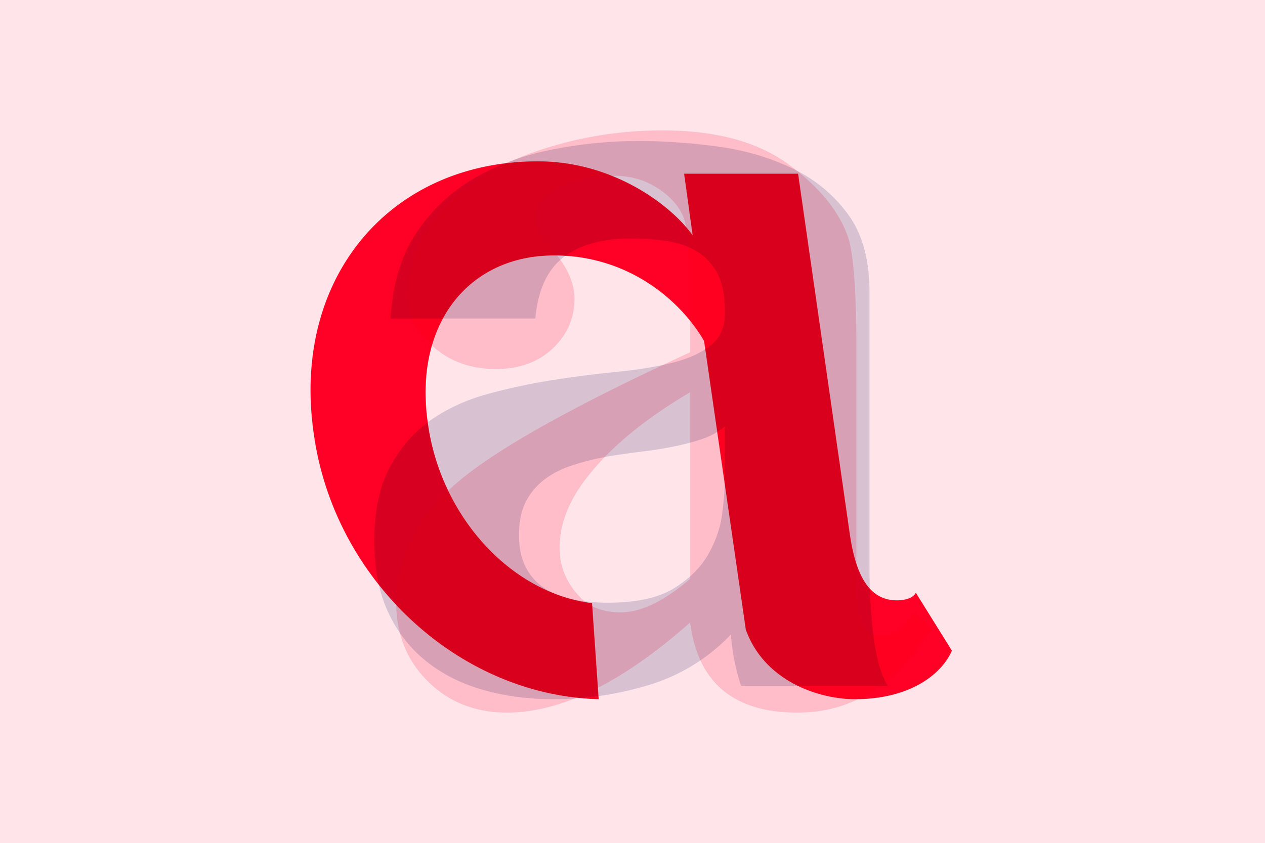
Sans Forgetica was designed under the scientific guidance of Dr Janneke Blijlevens and Dr Jo Peryman from RMIT’s Behavioural Business Lab. The font works using principles of psychology, fused with type design, to create a condition known as ‘desirable difficulty’. A desirable difficulty is an obstruction to a learning process that requires a considerable but desirable amount of effort, therefore improving (in Sans Forgetica’s case) retention and recall of information. Unlike more conventional fonts, Sans Forgetica’s visual distinctiveness causes readers to dwell longer on each word, giving the brain more time to engage in deeper cognitive processing, thus enhancing retention of that information.

Typeforms.

The design.

Graphic language.

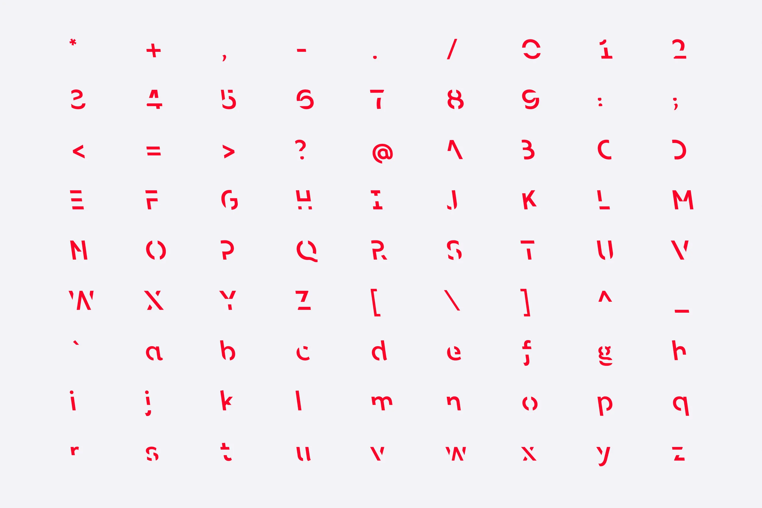
Character set.

Sans Forgetica’s unique design
We worked in collaboration with world-renowned typographer Stephen Banham and RMIT’s Behavioural Business Lab on the development of the font. Our team developed multiple typefaces with varying degrees of ‘distinctiveness’ built in. These subtle imperfections subvert many of the design principles normally associated with conventional typography, such as clarity, ease of processing and familiarity. The font that demonstrated the best improvement in memory retention, and went on to become Sans Forgetica, contained key design elements that question the Gestalt conventions of type with very unfamiliar typographic treatments. The result of adding these design elements is that the reader has to commit extra effort to their reading, leaving a better memory trace.

Execution elements.

Typeforms.

Digital/Social.

What’s next?
The team at RMIT have been inundated by academics from around the world, interested to collaborate on further research to investigate how the font innovation could be developed. In particular at how we could apply the principles of Sans Forgetica to other alphabets like mandarin, looking at possible clinical applications - alzheimer’s and dyslexia as well as inquiring into how we can get further distribution of the font by having it pre-installed or included in font packages such as Adobe Typekit for example - which would dramatically extend the reach. Sans Forgetica is a marketing and design innovation that now has big implications and potential for learning and language in the future.
Visit the Sans Forgetica website here.

Large format OOH.

Typeset.

“Font helps memorise what you read”
– BBC
“Sans Forgetica is probably the world’s ultimate study hack”
– Typeroom
“Pretty cool, huh?”
– Buzzfeed